The chart report
tSM reporting supports graphic visualization of the data gathered in the table aggregation. There are around 25 types of charts available for tSM users who seek analytics for their data. See [semantic versioning (docs) for more info about supported diagrams’ params.
Bar Charts
Vertical Bar Chart
Horizontal Bar Chart
Grouped Vertical Bar Chart
Grouped Horizontal Bar Chart
Stacked Vertical Bar Chart
Stacked Horizontal Bar Chart
Normalized Vertical Bar Chart
Normalized Horizontal Bar Chart
Pie Charts
Pie Chart
Advanced Pie Chart
Pie Grid
Line\Area Charts
Line Chart
Polar Chart
Area Chart
Stacked Area Chart
Normalized Area Chart
Other Charts
Bubble Chart
Box Chart
Heat Map
Tree Map
Number Cards
Gauge
Combo Chart
All of these types of charts work with the data which are selected in Configuration Row sections and agg values.
To see the charts, the user has to select chart mode at the top of the reporting window:
![]()
Use the Configuration tab for changing rows and data visualization values. Use the Chart tab for changing the chart type, color schema, legend location, and additional params for all types of charts.
The Chart tab contains five sections: Main, Dimensions, Legend, Options, and Custom colors
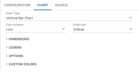
In the main section, the user can choose Chart Type, Color Scheme for Chart, and Scale Type (Original or Linear - used for a smoothing curve).
The Dimensions section supports chart resizing 
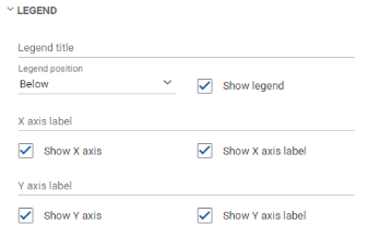
The Legend section contains a feature to manage legend location, axis positions, and captions
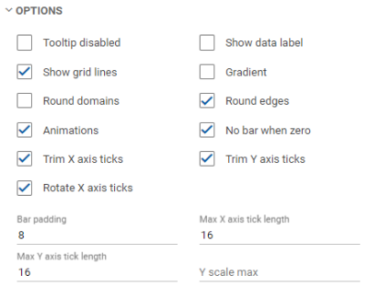
The Options section contains features to manage tooltips, grid lines, data labels, and other visual effects.
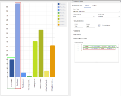
Custom colors
The user can customize colors for any part of the chart using manual customization.