Layout Designer
The Layout Designer is a powerful tool within the tSM Output Management system that allows users to visually design and configure document layouts. It provides an intuitive interface for building complex templates, including contracts, invoices, notifications, and other formatted documents. This guide explains the core functionalities of the Layout Designer and its key features.
Overview of the Layout Designer Interface
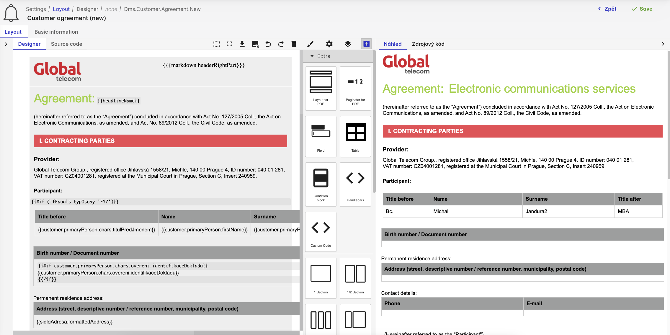
The Layout Designer interface is split into two main sections, as seen in the screenshot:
- Designer Panel (Left): Shows a preview of the document being designed. Users can see the live representation of the fields, tables, and other elements that are added to the layout.
- Toolbar and Component Panel (Right): Contains a set of tools and components that can be dragged and dropped into the document. This panel also provides configuration options for each element.
Key Elements of the Layout Designer
The following sections outline the primary components and features of the Layout Designer:
1. Designer Preview
The Designer Preview, shown on the left side, is a live editor that allows users to see how the document will be rendered. It shows the content as a real-time representation of the layout, complete with formatting, colors, and placeholders for data. This view includes:
- Header and Footer: Custom sections that can contain logos, titles, and other repeated content.
- Content Areas: The main body of the document, where fields, tables, and text elements are added.
Users can directly click on different parts of the layout to select and modify them. For example, text fields, condition blocks, and tables can be edited by clicking on the element.
2. Toolbar Options
The top toolbar provides a variety of tools for controlling and managing the layout:
- Save: Saves the current state of the layout.
- Undo/Redo: Steps back or forward through the most recent changes.
- Preview: Opens a preview window to show how the document will appear in its final form.
- Source Code View: Switches to a code editor to view and modify the underlying Handlebars code directly.
3. Component Library
On the right side, the Component Library offers various predefined elements that can be dragged into the layout. These components include:
- Fields: Simple text fields for inserting placeholders like
{{customer.name}}or dynamic text. - Tables: Used for structured data presentation, such as listing customer information or product items.
- Condition Blocks: Conditional logic that hides or shows sections based on data conditions.
- Handlebars Custom Code: Allows the addition of custom Handlebars code snippets directly into the document for advanced formatting.
- Sections Layouts: Different layout structures, such as single-column, two-column, or grid layouts, for better organization of content.
4. Element Properties
When a component is selected, its configuration options are displayed, allowing the user to modify various attributes, such as:
- Field Names: Change the Handlebars placeholder value, e.g.,
{{customer.firstName}}. - Visibility Rules: Add conditions like
{{#if customer.isActive}}to show or hide the element based on the data. - Formatting Options: Customize the font, size, color, and alignment.
Building a Template with the Layout Designer
Below is a step-by-step process for building a simple template using the Layout Designer:
-
Add the Header:
- Drag a Text Field component from the library and drop it in the header section.
- Set the text to
{{markdown headerRightPart}}to dynamically populate this field with a predefined markdown header.
-
Insert a Table for Customer Information:
- Drag the Table component into the main content area.
- Define the columns as
Title Before,Name,Surname, andTitle After. - Use placeholders like
{{customer.primaryPerson.chars.titulPredJmenem}},{{customer.primaryPerson.firstName}}, etc., for each cell.
-
Add Conditional Blocks:
- Insert a Condition Block for displaying specific sections based on customer type.
- Set the condition to
{{#if (eq typOsoby 'FYZ')}}for sections that should only appear for individuals.
-
Insert Static Text and Formatting:
- Use Custom Text Fields to add headings and static descriptions.
- Apply formatting by selecting the text and choosing styles such as bold, italics, or colors.
-
Preview and Save:
- Use the Preview button to see how the document will look with sample data.
- Once satisfied, save the layout using the Save button.
Source Code Integration
For more advanced scenarios, users can switch to the Source Code tab and directly edit the underlying Handlebars code. This view provides full control over the template structure, enabling the addition of complex conditions, loops, and custom helpers.
Example of Handlebars Code in Layout Designer
Here’s an example of a snippet used in the template:
This block renders a row in the table for individual customers (FYZ), showing titles before and after the name.
Layout Designer Best Practices
-
Use Condition Blocks for Flexibility: Use conditional logic to hide or show sections based on customer types, order details, or other data fields. This ensures that the layout is adaptable and dynamic.
-
Maintain a Clean Structure: Organize the layout into clearly defined sections (e.g., Header, Content, Footer) and use different Section Layouts to separate content logically.
-
Leverage Predefined Styles and Formatting: Use the built-in formatting options to keep the document visually consistent and professional.
Summary
The Layout Designer in tSM provides a rich set of tools for creating complex and visually appealing document layouts. Whether you are building simple templates or advanced multi-page documents, the Designer interface allows for flexibility and ease of use, combining visual design with the power of Handlebars templating.
For more information on specific components or to dive deeper into using the Designer, refer to the related documentation sections or tutorials.