Composite & Advanced Widgets
The Form Designer module provides a comprehensive set of components to build dynamic forms. The components are categorized into Layout Components, Data Components, and Other.
Layout Components
Text to display
Any text to display
- Selector:
tsm-display-text - Type: Layout Component
- Properties:
- localizationData (LocalizationVersionData = null): Used for localization purposes.
- text (string = null): Main text content to be displayed.
- formatText (boolean = false): Determines if the text should be formatted.
- fieldHtmlClass (string = null): CSS class applied to the host element.
{
  "type": "layout",
  "widget": {
    "type": "tsm-display-text"
  },
  "config": {
    "text": "Text"
  }
}
User register
The component allows selection from an enum with an input-based filter for a more convenient value selection.
- Selector:
tsm-register-value-lov - Type: Layout Component
- Properties:
- pageSize (number = 20): Page size for the listing (between 20 and 500).
- inputId (string): ID for the input element.
- removeChange (any = null): Not used in the template.
- hideCode (boolean = false): Determines if the code should be hidden.
- autofocusOptions (boolean = false): Enables autofocus options.
- disableLink (boolean = false): Disables links if true.
- selectFirstValue (boolean = false): Selects the first value by default.
- noneText (string = translationShared.shared.none): Text shown when no value is selected.
- showClear (boolean = true): Displays the clear button.
- keyboardOnMobile (boolean = true): Enables the keyboard on mobile.
- showNoneText (boolean = true): Displays the 'none' text.
- required (boolean): Marks the field as required.
- registerCode (string): Code for the register (required).
- filterField (string): Field to filter by.
- filterValue (string): Value to filter by.
- profileId (string): Profile ID for display columns.
- resultEmptyType (boolean = false): Returns a fake value when filterValue is empty.
- filterOperator (FilterOperator = FilterOperator.eq): Operator for filtering.
- style (object =
{width: '100%'}): Component style. - displayField (string = 'name'): Field to display.
- selectProperty ('id' | 'code' | 'name' | 'all' | 'custom' = 'code'): Property to select.
- multiselect (boolean = false): Allows multiple selections.
- selectionMode ('single' | 'multiple' = 'multiple'): Selection mode.
- returnType ('string' | 'array' = 'string'): Return type.
- customColumns (string[]): Custom columns.
- disabledRemoveValueAfterChangeFilter (boolean = false): Removes value after filter change.
- sortFunction ((a, b) => number): Custom sort function.
- defaultTreeViewMode (boolean = false): Sets default view mode to tree.
- selectItemFilters (FilterModel[] = []): Filters for selecting items.
- messageFromInvalidSelectItem (string = translationShared.shared.checkSelectedItemByFilters): Message for invalid selections.
{
  "type": "string",
  "title": "Code List",
  "widget": {
    "type": "tsm-register-value-lov"
  }
}
Button
The button element is an interactive UI component used to trigger actions, such as form submission or other tasks.
- Selector:
dtl-button - Type: Data Component
- Properties:
- layoutingType ('design' | 'runtime' = 'design'): Determines the layout mode.
- localizationData (LocalizationVersionData): Contains localization information.
- scriptResultEditor (boolean = false): Enables the script result editor.
- title (string): The button title.
- formTitle (string): Title of the form in a popup.
- dialogWidth (string): Dialog width.
- dialogHeight (string): Dialog height.
- formWidth (string): Form width.
- formHeight (string): Form height.
- scriptCode (string): Code to execute.
- hideScriptError (boolean = false): Hides script errors.
- linkUrl (string): URL for link button types.
- queryParams (Params): Query parameters.
- customIconCssClass (string): Custom icon CSS class.
- customCssClass (string): Custom button CSS class.
- readonly (boolean): Sets read-only mode.
- disabled (boolean): Disables the button.
- hidden (boolean): Hides the button.
- successMessage (string = translationShared.shared.succSave): Message on success.
- fileName (string = 'file'): Name for downloaded files.
- shouldValidate (boolean): Determines if validation is performed.
- buttonType (string): Button type.
- buttonAppearance (string): Button appearance.
- buttonSeverity (string): Button severity.
- getUrl (string): URL for GET requests.
- formAction (PopupFormActionType): Form action type.
- messageType (string): Message type.
- messageText (string): Message text.
- linkTarget (string): Link target.
- tooltip (string): Tooltip text.
- componentSelector (string): Selector for dynamic components.
- formCode (string): Form code.
- closeDialog (boolean): Closes the dialog if true.
- postUrl (string): URL for POST requests.
- okMessage (string): Message on OK.
- resultProperty (string): Property for results.
- payload (string): Request payload.
- dialogButtonTitle (string): Dialog button title.
- rootControl (TsmFormGroup): Root form control.
- redirectUrl (string): URL to redirect after action.
- successActions (ButtonActionModel[] = []): Actions on success.
- errorActions (ButtonActionModel[] = []): Actions on error.
- dynamicComponentInputs (any): Inputs for dynamic components.
- formContext (object = ): Form context.
{
  "type": "layout",
  "title": "Button",
  "widget": {
    "type": "dtl-button"
  }
}
Clipboard button
Button for copying the selected value to the clipboard.
- Selector:
dtl-clipboard-button - Type: Data Component
- Properties:
- layoutingType ('design' | 'runtime' = 'design'): Determines the layout type.
- localizationData (LocalizationVersionData): Used for localization.
- title (string): Button title.
- customIconCssClass (string = 'tsm-icon-clipboard'): CSS class for the icon.
- customCssClass (string): Additional CSS classes.
- disabled (boolean): Disables the button if true.
- hidden (boolean): Hides the button if true.
- tooltip (string): Tooltip text.
- buttonAppearance (string = 'p-button'): Button appearance.
- buttonSeverity (string): Button severity.
- value (string): Value to copy to clipboard.
{
  "type": "layout",
  "title": "null",
  "widget": {
    "type": "dtl-clipboard-button"
  }
}
Submit button
The submit button triggers a form submission event and stores the specified value in its state.
- Selector:
dtl-submit-button - Type: Data Component
- Properties:
- layoutingType ('design' | 'runtime' = 'design'): Determines the layout type.
- validationExpression (boolean = true): Determines if the validation message should be shown.
- validationMessage (string): Message when validation fails.
- valuesToSet (any): Values to set on click.
- title (string): Button label.
- tooltip (string): Tooltip text.
- disabled (boolean): Disables the button.
- readonly (boolean): Makes the button read-only.
- hidden (boolean): Hides the button.
- customCssClass (string): Custom CSS class.
- customIconCssClass (string): Custom icon CSS class.
- buttonAppearance (string = 'p-button'): Button appearance.
- buttonSeverity (string): Button severity.
{
  "type": "object",
  "title": "Submit button",
  "widget": {
    "type": "dtl-submit-button"
  }
}
Submit request button
This button triggers a form submission event that always sends a GET or POST request. The response is stored in the button’s state.
- Selector:
dtl-submit-request-button - Type: Data Component
- Properties:
- layoutingType ('design' | 'runtime' = 'design'): Determines the layout type.
- validationExpression (boolean = true): Expression to validate before action.
- validationMessage (string): Message when validation fails.
- valuesToSet (any): Values sent with the request.
- title (string): Button label.
- tooltip (string): Tooltip text.
- disabled (boolean): Disables the button.
- readonly (boolean): Makes the button read-only.
- hidden (boolean): Hides the button.
- customCssClass (string): Custom CSS class.
- customIconCssClass (string): Custom icon CSS class.
- getUrl (string): URL for GET requests.
- postUrl (string): URL for POST requests.
- formAction ('get' | 'post'): GET or POST action.
- buttonAppearance (string = 'p-button'): Button appearance.
- buttonSeverity (string): Button severity.
{
  "type": "object",
  "title": "Submit request button",
  "widget": {
    "type": "dtl-submit-request-button"
  }
}
Data Components
Monaco editor
The Monaco Editor provides advanced editing features including syntax highlighting and code completion, with support for multiple programming languages.
- Selector:
dtl-form-input-monaco - Type: Data Component
- Properties:
- updateIfDirty (boolean = false): Updates the editor when content is dirty.
- editorOptions (MonacoEditorConstructionOptions): Custom editor options.
- type ('string' | 'object' = 'string'): Specifies the type of input.
- language (string): Sets the language mode.
- widgetHeight (any): Height of the widget.
- inline (boolean = false): Displays the editor inline.
- resizable (boolean = true): Indicates if the editor is resizable.
- placeholder (string): Placeholder text.
- localizationData (LocalizationVersionData): Localization data.
{
  "type": "string",
  "title": "Java example",
  "widget": {
    "type": "monaco-editor"
  },
  "config": {
    "type": "string",
    "language": "java",
    "widgetHeight": "200px"
  }
}
Monaco diff editor
The Monaco Diff Editor allows you to compare two versions of content side by side.
- Selector:
dtl-form-input-monaco-diff - Type: Data Component
- Properties:
- swap (boolean = false): Swaps the original and modified content.
- original (string): The original content to compare.
- updateIfDirty (boolean = false): Updates even if the form is dirty.
- editorOptions (MonacoEditorConstructionOptions): Custom editor options.
- enableChangeRevert (boolean = true): Enables change revert functionality.
- type ('string' | 'object' = 'string'): Specifies the type of input.
- language (string): Sets the language mode.
- widgetHeight (any): Height of the widget.
- inline (boolean = false): Displays the editor inline.
- resizable (boolean = true): Indicates if the editor is resizable.
{
  "type": "string",
  "title": "Monaco diff editor",
  "widget": {
    "type": "monaco-diff-editor"
  },
  "config": {
    "type": "string",
    "language": "json",
    "widgetHeight": "200px"
  }
}
Other
Gallery
The gallery component allows you to upload and display graphic files, with the option to change the display theme.
- Selector:
tsm-gallery - Type: Other
- Properties:
- multiple (boolean = true): Allows multiple images.
- ownerId (string = null): Identifier for the owner.
- ownerType (string = null): Type of the owner.
- attachmentTypeCode (string = null): Attachment type code.
- theme ('basic' | 'expanded' | 'single' = basic): Gallery display theme.
- height (string = "450px"): Height of the gallery.
- fullscreenClickImage (boolean = false): Enables fullscreen on image click.
- compressImage (boolean = false): Determines if images should be compressed.
{
  "type": "layout",
  "widget": {
    "type": "tsm-gallery"
  }
}
File upload
The file upload component allows you to upload a file to an entity.
- Selector:
dtl-file-upload-widget - Type: Other
- Properties:
- context (ContextFrom = null): Provides component context.
- ownerId (string = null): Identifier for the owner.
- ownerType (string = null): Type of the owner.
- attachmentTypeCodes (string[] = null): Allowed attachment type codes.
- attachmentTypeAllowEmpty (boolean = true): Allows empty attachment types.
- allowDefaultDialog (boolean = true): Enables the default dialog.
- acceptDocumentTypes (string = "")*: Accepted document types.
- canDownloadFile (boolean = true): Allows file download.
- multiple (boolean = false): Allows multiple file uploads.
- setAndHideAttachmentType (boolean = false): Sets and hides the attachment type.
- hideDescription (boolean = false): Hides the description field.
- dropZoneLabel (string = null): Label for the drop zone.
- alwaysSaveToChars (boolean = false): Always saves to characters.
- tryDefaultValue (boolean = false): Uses default values if true.
- hiddenSizeUnit (boolean = true): Hides the size unit.
- hiddenWhenInserted (boolean = true): Hides insertion time info.
- hiddenWhoInserted (boolean = true): Hides inserter info.
- hiddenAttachmentTypeName (boolean = true): Hides the attachment type name.
- hiddenDeleteAttachment (boolean = false): Hides the delete option.
- parentPriv (string = null): Parent privilege string.
- enableGalleria (boolean = false): Enables galleria view.
- forceDisableDialog (boolean = false): Forces dialog disablement.
- forceEnableDetail (boolean = false): Forces detail view enablement.
- disableCache (boolean = false): Disables caching.
- maxFileSize (number = 5120): Maximum file size in KB.
{
  "type": "object",
  "widget": {
    "type": "dtl-file-upload-widget"
  },
  "config": {
    "attachmentTypeAllowEmpty": true,
    "allowDefaultDialog": true,
    "canDownloadFile": true,
    "acceptDocumentTypes": "*",
    "maxFileSize": 5120
  }
}
Inner form
This component allows you to insert another form into the current form’s content.
- Selector:
dtl-fluent-inner-form - Type: Other
- Properties:
- layoutingType ('runtime' | 'design' = null): Determines the layout type.
- rootFormId (string = null): Identifier for the root form.
- lazy (boolean = false): Loads the form lazily.
- hidden (boolean = false): Hides the form.
- loadNextButton (boolean = false): Controls the 'Next' button.
- autofocusOptions (boolean = null): Enables autofocus.
- schema (string = null): Form schema definition.
- charCode (string = null): Character code.
- formCode (string = null): Form configuration code.
- context (any = null): Contextual data.
- innerFormShowDisableErrors (boolean = null): Controls error message display.
{
  "type": "object",
  "title": "Form",
  "widget": {
    "type": "dtl-fluent-inner-form"
  }
}
Signature
Signature offers the option to create a signature by signing directly on the device.
- Selector:
tsm-signature-pad - Type: Other
- Properties:
- ownerId (string): Identifies the signature owner.
- ownerType (string): Specifies the type of the owner entity.
- readonly (boolean = false): Puts the signature pad in read-only mode.
- saveToAttachment (boolean = true): Saves the signature as an attachment if true.
{
  "type": "string",
  "title": "Signature",
  "widget": {
    "type": "tsm-signature-pad"
  }
}
Variable
This component allows you to insert a variable into the form. The variable’s value is stored in the $value object and can be used within the form.
- Selector:
dtl-variable - Type: Other
- Properties:
- placeholder (string): Placeholder text.
- localizationData (LocalizationVersionData): Used for localization.
{
  "type": "string",
  "title": "Variable",
  "widget": {
    "type": "variable",
    "hidden": true
  }
}
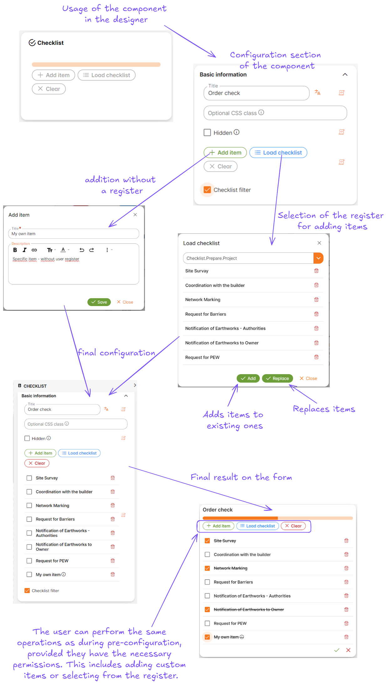
Checklist
This feature allows you to display items to remember and check off listed tasks for completion.
As part of the advanced attributes available in Forms Designer, it can be used in various contexts – for example, within a construction order, a task for a technician to ensure all steps are completed during the installation of equipment, and many other scenarios.
Basic Description
- The component allows defining a list of items
- Items are created:
- By inserting into the checklist
- By loading from the user register
- Adding new items
- Overwriting existing items
- Configuration:
- The configuration is the same as using a checklist
- Both in configuration and usage, it is possible to create and add items
- Everything is governed by the relevant permissions
- Progress Bar:
- Shows the current status of task completion
- A completed task is simultaneously checked off
- The order of items is determined by the register
- Newly added items are always placed at the end
Details
- Component in the form designer:
- Section “Advanced”
- The component contains:
- Progress bar
- Functionality:
- Add an item: adds another item to the checklist for completion
- Load items: loads a list of items from the user register
- Delete all: deletes all items in the configuration
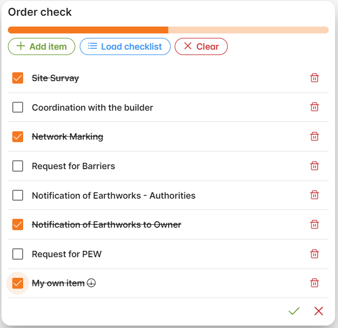
- List of items:
- Checkbox: marks the item as completed
- Item: describes the item with an optional tooltip
- Option to delete
- Item marking:
- Text will be crossed out
- The change will be audited by default
- Component settings:
- Standard attributes (ID, permissions, hidden, etc.)
- Specific attributes:
- Default item list (ITEM):
- Select names from the CheckLists register (multi select)
- Option to add a custom item - type into an editor (each comma-separated item will be an item, or each line will be an item)
- Default item list (ITEM):
Permissions
The use of the component is governed by assigned permissions
- Permissions:
Config.Checklist.AddItemConfig.Checklist.LoadItemsConfig.Checklist.ClearAllConfig.Checklist.CheckItemConfig.Checklist.RemoveItemConfig.Checklist.RemoveLoadItemConfig.Checklist.AppendItemsConfig.Checklist.ReplaceItems
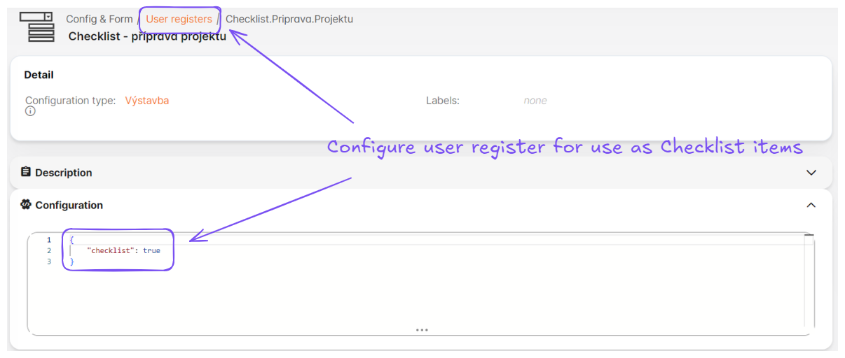
User Register Definition
The checklist allows loading default values from registers:
- These are standard user registers
- One register = one list of values
- Parameters:
Code- value in JSON formatName- one requirement in the checklistOrder- Display order within the given list
User Register List Limitations
- Registers for display must have the following configuration value:
"checklist": true
Example of Resulting JSON Structure:
{
  "id": "3b9090e1-329f-4efa-9dd2-d21a9a274e47",
  "title": "Request for PEW",
  "checked": false,
  "description": null,
  "registerCode": "Checklist.Prepare.Project",
  "registerValueCode": "Request.For.PEW"
},
{
  "id": "e6e3c760-c494-419b-aa31-c145f341fae2",
  "title": "My own item",
  "description": "<p>Specific item - without user register</p>",
  "checked": true
}
Example of Usage
Configuration of the user register
Configuration of the checklist