Components overview
This documentation provides an overview of the different types of components available in the tSM Form Designer, focusing on Data Components and Layout Components. Data Components are responsible for capturing and storing user input, which is serialized into JSON format, while Layout Components handle the structure and presentation of the form without storing any data. Additionally, tSM Widgets are specialized components that integrate seamlessly with various modules in the tSM platform (e.g., CRM, Billing, Ticketing, DMS), offering dynamic and contextual interactions within forms.
The document also covers:
- Basic Components such as text inputs, checkboxes, and select boxes.
- Component Configuration options including validation, CSS styling, and interactivity (e.g., read-only, disabled).
- Layout Configuration with margin, padding, and border options using units like rem, em, px, and percentage.
- Storage Methods that define how form values are managed and persisted, depending on the field's read-only or editable state.
- Multilingual Support through translations for form fields across different languages.
Component types
In form design, components are typically divided into two main categories: Data Components and Layout Components. Each plays a distinct role in how forms are built, displayed, and interacted with by users.
Data components are responsible for capturing and managing user input. They store data that is later submitted or processed by the application, and this data is typically serialized into a JSON format. Data components directly contribute to the data model of the form. The values entered into these components are stored in JSON format and are part of the application's data structure. Examples:
- Text input, Numeric, Data & time fields
- Select boxes and dropdowns
- File upload components
- tSM Widgets - components that are specific to tSM platform such as Customer Selector, Register value, etc.
Layout components control the structure, organization, and visual arrangement of the form. Unlike data components, they do not store any data or contribute to the data model. Examples:
- Containers for grouping form fields (e.g., panels, cards, fieldsets)
- Navigation elements (e.g., tabs, accordions)
- Buttons and links for navigation or actions
- Content elements for static text or additional help information
| Aspect | Data Components | Layout Components |
|---|---|---|
| Purpose | Capturing and storing user input. | Structuring and organizing form elements. |
| Data Storage | Stores data in JSON format, contributing to the application’s data. | Does not store data, but can access form data for scripting. |
| Examples | Text fields, select boxes, date pickers, checkboxes. | Containers, panels, tabs, accordions, buttons. |
| Behavior | User input is saved and serialized into the data model. | Controls the presentation and layout of form elements. |
| Interaction with Data | Directly interacts with data, storing user input. | No direct interaction with data, but can access it for display logic (e.g., showing/hiding sections). |
Basic Components
A wide variety of basic form components are available, including:
- Text Input: Allows users to input simple text.
- Long Text: Designed for multiline inputs like descriptions or comments.
- Numeric Fields: For numbers, like temperature in this example.
- Date & Time Pickers: Useful for scheduling or timestamp fields.
- Checkboxes: Standard options for binary choices, with additional tri-state options.
- Select Boxes: For dropdown lists of pre-defined options.
- Switches and Sliders: For toggling states, among many others.
Layout Components
Layout components are used to define the structure and visual organization of the form. Unlike data components, layout components do not store any data within the application. However, they can still access form data and context through scripting, such as hiding a section based on a field’s value. These components play a vital role in determining how the form is displayed to the user and how the various elements are arranged on the screen.
Some common types of layout components include:
-
Containers: Containers define sections of the user interface and are used to group other components. Examples include the 12-column layout, in-place editing components, and panels. The In-Place layout component is a special type used for inline form editing.
-
Cards: Cards present information in a compact and organized manner, typically used to display details such as product information or user profiles.
-
Navigational Elements: These components help users navigate within the form. Examples include accordions, which allow content to be expanded or collapsed, and tabs for switching between different sections of the form.
-
Buttons and Links: These components are used to execute actions or navigate to different screens. They are essential for form submission, navigation, and interaction.
-
Content: These components are used to add additional static content for the user, such as help text, static information, or even complex HTML-based UI elements.
Layout components ensure that forms are user-friendly, organized, and visually structured in a way that enhances the overall user experience.
tSM Widgets
tSM Widgets are specialized components within the tSM (Telecommunication Service Management) system that interact with different tSM modules. These widgets serve as the building blocks for designing forms and workflows that connect to various functionalities within the tSM platform. They provide a structured way to integrate data and actions across multiple modules, such as CRM, Billing, Ticketing, DMS (Document Management System), and more, directly into the user interface.
tSM Widgets can adapt to the context in which they are used. For example, a Ticketing widget may display different information based on the user's role or the current status of a ticket, providing a personalized experience.
Examples of tSM Widgets:
-
Ticketing Widgets: The Ticketing module offers a variety of widgets that allow users to manage and view tickets:
- Ticket List: Displays a list of tickets based on various filters.
- Ticket Task List: Provides an overview of tasks related to specific tickets.
- Advice List: Offers advice or guidance related to tickets.
- Ticket History: Shows the historical changes and updates made to tickets.
- Ticket Details: Provides detailed information about a specific ticket, including category, status, priority, and severity.
- ...
-
DMS (Document Management System) Widgets: The DMS widgets allow users to manage documents and related content:
- Notifications: Manages notifications related to document updates or changes.
- Comments: Enables adding and managing comments on documents or files.
- Worklogs: Tracks time or effort spent on specific documents or tasks.
- Attachments: Facilitates uploading and managing file attachments.
- Comment Types: Defines types of comments that can be used for categorization.
- Notification Template: Allows the configuration of templates for document notifications.
- ...
-
... and many more such as CRM, Billing, Change Management, Audit, Inventory and Stock, User Management, Process Management, etc.
Component Configuration
Each component comes with configurable properties available in the right sidebar.
- Common Properties: Basic settings like title, placeholder text, and tooltip.
- Validations: Rules to ensure data integrity, such as required fields or specific formats.
- Height and CSS Classes: To further customize the appearance and behavior of the form.
- Many others, depending on the component.
The designer supports advanced configurations for more complex form requirements, such as data validation and conditional logic.
You can use scripting to define custom behaviors, such as showing or hiding components based on user input.
Common Properties
Common properties include:
- Key: The unique identifier for the field in the form data. This is also the key in the JSON schema. Changing this key will affect the data structure, so it should be used carefully. Use standard naming conventions to ensure consistency, for JSON schema the typical naming convention is camelCase (e.g. firstName, hostname, customerId, myLongFieldName).
- Title: The label that appears beside the field (e.g., "First name").
- Title Position: Where the label is positioned (Left, Up, Right). There is a special option "Label position by form type", for example characteristics can be displayed both in dialog (such as new ticket creation form) and in the detail form (ticket detail). By default, tSM use "Up" position for dialog forms and "Left" for detail forms.
- Placeholder Text: A hint to guide users about what to input.
- Tooltip: Provides additional information when the user hovers over the component.
- Optional CSS Class: CSS class for modifying the style of a component. You can use common Tailwind CSS classes such as:
- text-2xl: Sets the text size to "extra-large."
- bg-red-500: Applies a red background with intensity level 500.
- flex: Utilizes the flexbox layout.
- w-full: Makes the component take the full width of its parent.
- gap-2: Adds a gap of size 2 between flex items.
- flex-column: Arranges flex items in a column direction.
- p-4: Applies padding of size 4 on all sides of the component.
- Optional CSS label Class: Custom CSS classes that can be applied to style the text field (such as text-2xl, font-bold, text-red-200, etc.).
- Hide Title: A checkbox to hide the label if not required.
- Hidden: Makes the field invisible, though it remains part of the form.
- Read Only: Makes the input field read-only, preventing user modification.
- Disabled: Disables the input field, making it non-interactive. The value is visible, but the color is gray and it is not editable.
- Storage: Controls how data is persisted (e.g., ReadonlyBased, Always, Never). See explanation bellow.
- Default Value: Pre-filled data that appears when the form loads.
Validation
Component layout
The Layout section defines the spacing and structure around a component using CSS properties such as margin, border, and padding. These properties control the positioning of the component within the form and its relationship with neighboring elements.
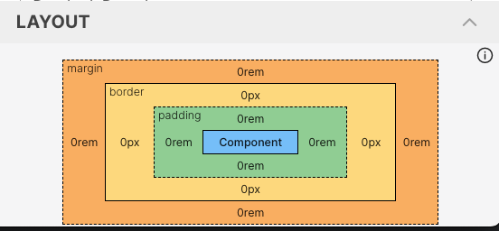
Box Model Overview:
- Component: This is the core content of the element, represented in blue. It is the actual component being displayed in the form (e.g., text box, button).
- Padding: Represented in green. Padding creates space inside the component, between the content and its border.
- Border: Represented by the yellow dashed outline. The border surrounds the padding and content, visually separating the component from the outside world.
- Margin: Represented in orange. The margin creates space outside the component, separating it from other elements in the layout.
These layout properties provide granular control over the component’s position and appearance, allowing developers to create forms with precise spacing and structure.
When configuring layout properties such as margin, padding, and border, different unit types can be used to specify values. These units determine the size of the spacing and can be relative, absolute, or percentage-based:
- rem (Root Em): Relative to the font size of the root element. Use this unit if you need to scale the spacing based on user settings of compact mode. I the root font size is 16px, 1rem is equal to 16px.
- em (Em): Relative to the font size of the element. Use this unit if you need to scale the spacing based on the font size of the component. For example margin: 2em means twice the size of the parent element's font size.
- px (Pixels): Absolute unit of measurement. Use this unit if you need to specify a fixed size for the spacing. margin: 10px
- % (Percentage): The percentage unit is relative to the size of the parent element. For example, if a parent element has a width of 200px, setting margin: 10% will result in a margin of 20px.
Storage
It can be challenging to understand how different storage configurations handle form values in case of the default value is calculated by a script. Here is a breakdown of the different storage methods:
- ReadonlyBased: Displays the saved or default value but never saves changes in readonly mode. In editable mode, the value is displayed, can be modified, and saved.
- Always: Always displays and saves both the saved and default values, regardless of readonly status.
- Never: Displays the saved or default value but never saves any changes, whether readonly or not.
- Computed - always saved: Displays a computed value that is always saved and modifiable if not readonly.
- Computed not save: Displays a computed value that is never saved, even if modified.
The table bellow helps define how different storage configurations handle form values, whether they are stored, displayed, or modified.
| Storage method type | Readonly: yes (Saved value: yes) | Readonly: yes (Saved value: no) | Readonly: no (Saved value: yes) | Readonly: no (Saved value: no) |
|---|---|---|---|---|
| ReadonlyBased | Displays the stored value and is never saved. | The calculated value from the default (if set) is displayed and is never saved. | The saved value is displayed, can be modified and it is saved when changed. | The calculated value from the default (if set) is displayed, can be modified and it is saved when changed. |
| Always | The saved value will be displayed and always saved. | The calculated value from the default (if set) is displayed and is always saved. | The saved value is displayed, can be modified and is always saved. | The calculated value from the default (if set) is displayed, can be modified and is always saved. |
| Never | The saved value will be displayed and never saved. | The calculated value from the default (if set) is displayed and is never saved. | The saved value is displayed, can be modified and is never saved. | The calculated value from the default (if set) is displayed, can be modified and is never saved. |
| Computed - the computed value is always saved | The default computed value is always displayed (if set) and is always saved. | Always display the calculated value from the default (if set) and always save. | The default calculated value is always displayed (if set), it is possible to modify it, but the calculated value is always saved. | The default calculated value is always displayed (if set), it is possible to modify it, but the calculated value is always saved. |
| Computed not save - value is never saved | The default computed value (if set) is always displayed and never saved. | The default computed value (if set) is always displayed and never saved. | The default calculated value is always displayed (if set), it can be modified, but it is never saved. | The default calculated value is always displayed (if set), it can be modified, but it is never saved. |
Translation
tSM instance is configured with list of supported languages. The designer allows you to define translations for form components, making it easy to create multilingual forms.
Each property that can be translated has a language selector, allowing you to specify the text for each supported language.